

01380 830633
Has your website got the wow factor?

Has your website got the wow factor?
Technology
Web development projects can range from the creation of simple brochure websites, to complex bespoke web applications that automate your business.
Our websites are mobile friendly and can have components we have written both on the web server and on the client, enabling all sorts of features to be added.
One of our clients wanted to market his products in Japan, take a look at a website with Japanese text! And its English equivalent.
One of our clients wanted to market his products in Japan, take a look at a website with Japanese text! And its English equivalent.
Why are mobile friendly websites important?
Your websites need to look great on all the new types of devices that are available.
A few years ago, there were only desktops and laptops typically with screen resolutions of between 1024 and 1400 pixels wide. Websites were therefore usually designed to be just under 1000 pixels wide and larger screens had an area with artwork in it (or just plain space) that filled the rest of the screen.
Now well over half of website access is via smart phones or tablets, some of which are physically small and low resolution. This trend is set to continue with cheap smart devices well under £100. Many business professionals who leave their laptop at work and only access the web via a tablet or smartphone in the evening. Also, at the other end of the spectrum there are very large, high resolution desktop screens wider than 2000 pixels.
It is important that your website responds to the device that it is being viewed on and provides the user with the best possible online experience.
Instead of creating many alternate layouts for your website, we detect how wide the screen is, on which the website is being viewed and optimise the layout accordingly. If this is not done, many potential customers will not be able to view your website. Also, many of the new types of devices do not support 'hover', so the website must not rely on this for menus etc.
All of our new websites are designed to work on the many types of device that are available and to pass the Google Mobile Friendly Test.
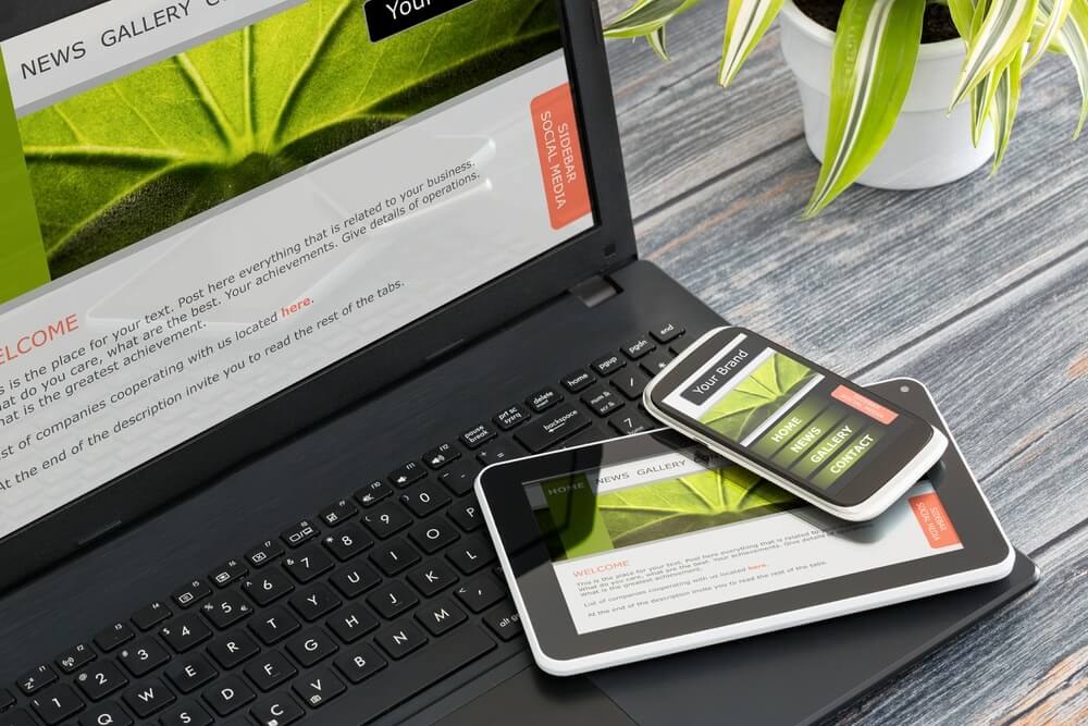
Access this website on a desktop in a browser window that is not full screen. Look at various parts of the site in windows of a different width and you can see how we change the layout for different screen sizes. Then run this website on a tablet and a mobile phone.
Things look slightly different, but all the information is still there.
SSL Security - HTTP vs HTTPS
Hyper Text Transfer Protocol Secure (HTTPS) provides a secure protocol over which data is sent between your browser and a website you are viewing. With HTTPS the communication between your browser and the website is encrypted. HTTPS is often used to protect highly confidential online transactions like online banking and online shopping order forms, but also means that simpler things like contact forms are also protected by encryption.
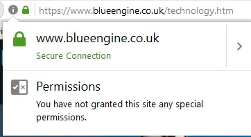
Browsers; Edge, Firefox and Chrome display a padlock icon in the address bar to indicate that HTTPS is being used.
Communications sent via HTTP connections are unencrypted and can be read by a hacker that manages to intercept the connection between your browser and the website. If the information is sensitive then this becomes a security threat. With an HTTPS connection a hacker would not be able decrypt the data.
Even if you are not concerned about HTTPS from a security perspective, HTTPS is important because Google now uses HTTPS as a positive ranking signal.
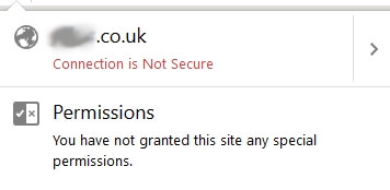
Also, Google Chrome, Firefox and Opera now label non-HTTPS sites as 'Not Secure' which will discourage visitors from trusting them.
This is the warning currently given by Firefox (August 2017).
This is the confirmation of a secure connection currently given by Firefox (August 2017).
All the major browsers are planning to warn users not to use forms on any page that doesn’t have HTTPS. This includes any contact forms on your website. These warnings will not prevent users from filling out contact forms but they will strongly discourage anyone from doing so. If your site does not have HTTPS, you may see a substantial decrease in the number of contact form submissions.
To sumarise, the major benefits of HTTPS are:
- Customer information is encrypted and cannot be intercepted
- Customers are more likely to trust sites that use HTTPS
- If your website is not using HTTPS/SSL your website credibility and search engine rankings may be affected

Interactivity and animation
The internet is exploding with new ways of providing client side interactivity and animation that gives websites the wow factor.We keep current with these trends and technologies.
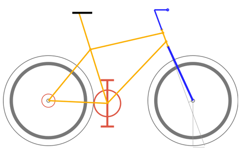
Take a look at our exploitation of the new HTML5 canvas api in our new bicycleCalculator website.
You can visually compare the geometry of different bicycles and save schematic diagrams of a bicycle's geometry for further analysis.
Websites with parallax effects are very contemporary and interesting. As you scroll down the page, if different components scroll at different rates interesting visual effects can occur. The most prominent being parallax, whereby the position or direction of an object appears to differ when viewed from different positions giving a 3D effect.
Has your website got the wow factor?
As you scroll this page you can see the image at the top of the page (and repeated above) scrolls at half the rate of the text on it, giving the effect that the page has three dimensional depth.
Server side technology
When you visit a 'static' brochureware website you get the same 'static' webpage every time. Every visit produces the same result!There are two ways this can change.
- The server can provide the same page, but the last time you visited that page 'cookies' can be left so that when you next visit it, although the same page is served up, it's appearance is modified. This technique can be used to personalise the visit; for example, to save form based data or to customise the visit via saved user preferences.
- An application (computer program) running on the web server can access data, make decisions, apply logic and serve up a completely different web page. For example, when you enter different phrases into a search engine each set of results is different. A program running on a server produced the different pages.
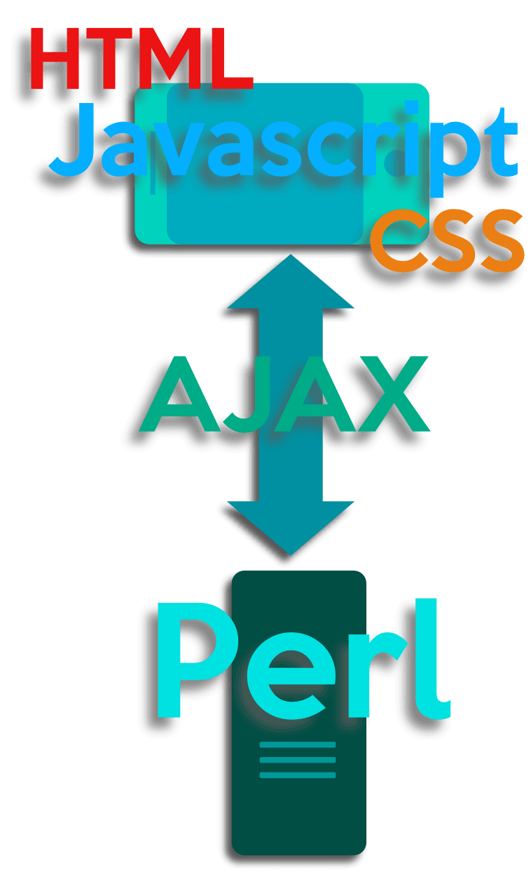
Technology should underpin business requirements - not be there for its own sake. How does this translate into something you will find useful?
Ultimately the limit is our programming capability and your imagination.
Just for example, server side code makes all the following features possible:
- Forms based applications. E.G. An online and secure facility for administering a club with a database back end.
- Make some pages/features in your website secure so only signed on members can see them.
- Websites where the owner can update the content, whether it is information on current stock or bargains or other features. Allow you to upload photos and descriptive text - great for vendors selling goods where thay want to place pictures alongside text. i.e. car and motorcycle dealers, estate agents etc. You can easily update content in predetermined areas without going to a full content management system and without getting the website supplier involved.
- Access all sorts of web based data.
We have standard pre-written code that allows you to update information on your website. To try out this feature for yourself go to our user update demo site.
The Old English language
We are very proud of our: Old English Translator Old English is a precursor of the Modern English language. Spoken between the 5th and 12th century in areas of what is now England and Southern Scotland.

The translator is an example of a serverside application written in Perl and it translates Old English to Modern English and vice versa. It involves some very complex server side processing to marry both sets of grammar and carry out the actual translation process.
This website was a labour of love. It took 100s of hours to produce. We have received compliments from many academics for this work including some in the USA who use the translator as part of their coursework in Old English language studies. This site usually achieves over 2000 hits per day and sometimes over 3000!
Rowmead
Capps Lane
Westbury
Wiltshire
BA13 4NF
Capps Lane
Westbury
Wiltshire
BA13 4NF
phil@blueengine.co.uk
01380 830633
Terms and Conditions
© Blue Engine Web Development 2008-2024
Bespoke Web Design and Development Services in Wiltshire
Websites for local customers in Westbury, Trowbridge, Warminster, Frome, and Devizes, as well as for customers throughout Wiltshire, Somerset and UK wide.
© Blue Engine Web Development 2008-2024
Bespoke Web Design and Development Services in Wiltshire
Websites for local customers in Westbury, Trowbridge, Warminster, Frome, and Devizes, as well as for customers throughout Wiltshire, Somerset and UK wide.